Content '10 was disappointingly cancelled, so after taking a year off, Content was back this year reportedly with a lot of support. I was ecstatic, as Content's first year of 2009 was amazing. Such a great showcase of the independent, "weird" (I say ideal), and soulful place of Portland. But walking away last Saturday night I was a bit less enthused about the entire experience. What was it missing? Less time to plan this year? Too many politics? The pressure of the expectations? Never as good as the first time? Le sigh. There seemed to be less of a fusion of music, art, and fashion as before. And less of a communal feel, with no focal afterparty (only many fragmented small ones). My criticisms mounted as I walked through the 28 rooms of the independent Portland designers.
I still enjoyed myself immensely and think there is a lot of talent in little PDX, this just wasn't the best of show. I must say I did love the addition of the champagne room (no, not the type you used to frequent/work. Though this is Portland, so I wasn't sure what to expect...). And it wasn't just solely fashion. Performance art for Content? But of course, I want more! Though after Adam Arnold's performance last year or the amazing band in Sword and Fern's room, how can anyone follow that? Well, with a performance in one room from a collaboration of a costume designer, graphic designer, fabricator, lighting designer, sound artist, composer and a puppeteer (SYS/Jayme Hansen. Didn't post photos as with the crowd and lighting I didn't get any decent shots). Loved it!
Here are a few of my highlights.
Sarah Seven. I love her designs, but the room was the tiniest box and did not showcase her amazing talent. Loved the lighting and ethereal feel, though.
Carly Mick and Susanna Hohmann. This dress was utilitarian, retro but modern, and beautiful. Very Rosie the Riveter for 2011. The dress, singular. I say this because though there were 5 different dresses shown, it was the same basic design in different dyed fabric.
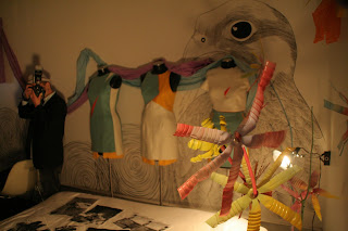
AfterAll creative studio. An art instillation, really. I just loved the effects of the feathers, mirrors, and lights. Like a beautiful dream. Me pictured, totally enthralled.
Haunt. Definitely favorite. I fawned over their rack for hours (sounds a bit scandalous, but really, they had an amazing clothing line)!
Frocky Jack Morgan. I imagine their inspiration is Helena Bonham Carter. Great to run into an old friend that was modeling for them (Suzy rocked it). Always love FJM's shabby vintage luxe look. And I just was enthralled with the wolf taxidermy table.
IDOM. Her room did not have the same impact on me as 2 years ago, but I do oh so love her style. Especially the 60s madame with a turban.
Dawn Sharp. The shadow images of the mosques on the dress and the photos of Jerusalem on the walls created such an amazing concept. Sacred imagery combined with a modern fantasy. But when I asked for the inspiration her response was, "She is the queen of 2012, this represents when the UFOs land on the churches." I had hoped for a response more worldly than "churches" to blanket represent the fantasy religious apocalypse I think she was trying to represent. I still love the concept and the result. Beautiful.
I love Duchess Clothier. Amazing custom designed men's clothing, absolutely love them. But this was definitely a last minute job on room design...at least I hope.
Bridge & Burn. Very Portland hipster style meets lumberjack.
Andy Lifschutz jewelry. Loved him the previous year and one of the few rooms I loved more in 2011. So unique, combining bone, stone, and metal.


Moonwoods. I hate to wear glasses. I'm in denial that distant neon signs are starting to look fuzzy. I think lasik surgery may be in my future, but do I wish I had the features to wear them because I love a girl or guy in glasses, especially such organic, beautiful ones as these. I just don't have that delicate face that can balance the strong wooden frames of Moonwoods. But if I did I would so be rockin' a pair of these. I think they will be the next pair of glasses for my husband, who could pull these off beautifully.
The Student Stylists from The Art Institute of Portland. Loved the 60s inspired looks.
Love the women's line of Studio SKB. Now there is a men's line called Chicago Harper. There was a 1930s inspired amazing blouse and skirt on the side rack that is the first on my list to buy. As far as the men's line, I just couldn't take my eyes off the man in the white suit. A great modern twist on the Gatsby-esque white linen suit.
Ruki. Wearable art. Love, love, love.
Pattern People. Peeping through a small hole into the room. Very voyeuristic. I loved this concept. And I love pattern and adornment. There was a rumor a naked man randomly ran through. Through a miniature box room? That would be one small...man.
All photos by my husband and me.
I still enjoyed myself immensely and think there is a lot of talent in little PDX, this just wasn't the best of show. I must say I did love the addition of the champagne room (no, not the type you used to frequent/work. Though this is Portland, so I wasn't sure what to expect...). And it wasn't just solely fashion. Performance art for Content? But of course, I want more! Though after Adam Arnold's performance last year or the amazing band in Sword and Fern's room, how can anyone follow that? Well, with a performance in one room from a collaboration of a costume designer, graphic designer, fabricator, lighting designer, sound artist, composer and a puppeteer (SYS/Jayme Hansen. Didn't post photos as with the crowd and lighting I didn't get any decent shots). Loved it!
Here are a few of my highlights.
Champagne Room. A first stop (and perhaps a second, though never a third. Okay, never say never).
Champagne Room. A first stop (and perhaps a second, though never a third. Okay, never say never).
Sarah Seven. I love her designs, but the room was the tiniest box and did not showcase her amazing talent. Loved the lighting and ethereal feel, though.
Carly Mick and Susanna Hohmann. This dress was utilitarian, retro but modern, and beautiful. Very Rosie the Riveter for 2011. The dress, singular. I say this because though there were 5 different dresses shown, it was the same basic design in different dyed fabric.
Haunt. Definitely favorite. I fawned over their rack for hours (sounds a bit scandalous, but really, they had an amazing clothing line)!
Frocky Jack Morgan. I imagine their inspiration is Helena Bonham Carter. Great to run into an old friend that was modeling for them (Suzy rocked it). Always love FJM's shabby vintage luxe look. And I just was enthralled with the wolf taxidermy table.
IDOM. Her room did not have the same impact on me as 2 years ago, but I do oh so love her style. Especially the 60s madame with a turban.
Dawn Sharp. The shadow images of the mosques on the dress and the photos of Jerusalem on the walls created such an amazing concept. Sacred imagery combined with a modern fantasy. But when I asked for the inspiration her response was, "She is the queen of 2012, this represents when the UFOs land on the churches." I had hoped for a response more worldly than "churches" to blanket represent the fantasy religious apocalypse I think she was trying to represent. I still love the concept and the result. Beautiful.
I love Duchess Clothier. Amazing custom designed men's clothing, absolutely love them. But this was definitely a last minute job on room design...at least I hope.
Andy Lifschutz jewelry. Loved him the previous year and one of the few rooms I loved more in 2011. So unique, combining bone, stone, and metal.


Moonwoods. I hate to wear glasses. I'm in denial that distant neon signs are starting to look fuzzy. I think lasik surgery may be in my future, but do I wish I had the features to wear them because I love a girl or guy in glasses, especially such organic, beautiful ones as these. I just don't have that delicate face that can balance the strong wooden frames of Moonwoods. But if I did I would so be rockin' a pair of these. I think they will be the next pair of glasses for my husband, who could pull these off beautifully.
The Student Stylists from The Art Institute of Portland. Loved the 60s inspired looks.
Ruki. Wearable art. Love, love, love.
Pattern People. Peeping through a small hole into the room. Very voyeuristic. I loved this concept. And I love pattern and adornment. There was a rumor a naked man randomly ran through. Through a miniature box room? That would be one small...man.
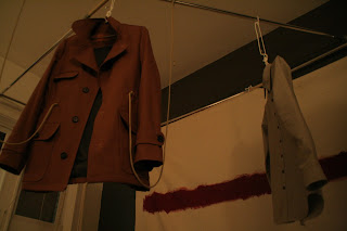
John Blasioli. My husband has a man crush on him. After 2009 Content he phone stalked him trying to get a jacket made. His newer line is a bit more formal, but still with amazing detail.
28 rooms in all. The designers were not as well represented as they could have been. Start planning for next year, I say! A big thanks to the organizer. Do I need to even name? I mean, I've never seen project runway, but even I know who this talented girl is. Thanks, Gretchen (with Killian Repasky, right, fashion loving teen) and Ace Hotel!


